Graphic Design Essentials for Brand Impact: Make Every Visual Speak Louder 🎨
In today’s visual world, your brand’s graphic design is your handshake—it’s the first impression people feel before they even click. Whether it’s your logo, business cards, pamphlets, or digital marketing materials, every pixel counts.
Let’s dive into the non-negotiable essentials that ensure your visuals are sharp, memorable, and strategically aligned with your brand’s voice—and sprinkle in some witty flair, because why not?
1. Start with a Strong Logo
Your logo is the visual cornerstone of your brand identity.
✓ Keep it simple and scalable
✓ Ensure it works in full color, grayscale, and monochrome
✓ Pick fonts and shapes that reflect your brand personality (modern, friendly, bold?)
A strong logo = a tiny visual billboard that works everywhere.
2. Choose a Consistent Color Palette
Colors evoke mood, memory, and meaning—use them wisely.
-
Pick 2–3 primary colors plus 2–3 complementary accents
-
Ensure accessibility compliance (contrast ratios matter!)
-
Stick to your palette across print and digital materials
When your brochure, banner, and apparel all sing in harmony, you’ll be unforgettable.
3. Typography That Speaks Clearly
Fonts can elevate or annihilate a design.
-
Use a web-safe font for digital and a print-ready option for hardcopy
-
Limit yourself to 2–3 fonts max
-
Maintain clear hierarchy: Headline, Subhead, Body — and don’t dread the spacing!
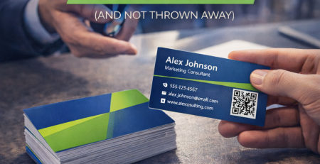
4. Print Design: Prepare with Precision
From business cards to pamphlets to banners—if it’s printed, it’s personal.
🔍 Double-check everything:
-
Bleed & margins are set
-
CMYK color mode, not RGB
-
Text is outlined or embedded fonts are packaged
-
High-res images (300 dpi minimum)
Avoid those nightmare client calls: “Why is my logo cut off?”
5. Cohesive Marketing Materials
Your materials are your brand ambassadors.
-
Keep style consistent across cards, flyers, social banners, email headers
-
Use visual elements (icons, shapes) to tie everything together
-
Reflect the same tone in copy and design
This unity builds trust and recognition—because consistent brands inspire confidence.
6. Digital-Friendly Designs
If it’s going on Facebook, email, or your site, design it digital-first.
-
Use the correct dimensions and formats (PNG/JPG/SVG)
-
Optimize file sizes for fast loading
-
Maintain visual consistency from screen banner to printed banner
-
Include CTAs visually in banners and digital headers
Think about scroll-stopping visuals that also load fast—no compromises.
7. Seek Feedback & Refine
Great design isn’t made in a vacuum.
-
Share early mockups with stakeholders
-
Test readability and impact on-screen and in-print
-
Iterate based on their feedback—trim the clutter, sharpen the message
-
Finalize and export in all needed formats (PDFs for print, PNGs/SVGs for web, etc.)
This structured feedback loop is what turns “nice” into “unforgettable.”
Why These Essentials Matter
Because polished, consistent visual branding leads to:
-
Better brand recognition and recall
-
Increased brand professionalism and trust
-
Consistency across touchpoints, both online and in print
-
More engaging marketing materials that drive conversions
Your visuals aren’t just decoration—they’re strategic assets that support your brand goals.
🎯 How GallantMEDIA Can Help
At GallantMEDIA, our graphic design services go beyond aesthetics to deliver strategic impact. We help you:
-
Craft or refresh a strong, scalable logo
-
Build a consistent color palette and typographic system
-
Design print-ready assets (business cards, pamphlets, banners)
-
Develop cohesive digital graphics for social, web, and ads
-
Ensure all designs are consistent across media and print-ready
Let us elevate your visuals so your brand is seen, remembered, and taken seriously—everywhere.